So the Sharks changed their crest and their sweaters this year. This is really the kind of thing I should've commented upon at the start of the season, but, well, this blog wasn't around then. Unlike most hot preseason topics, it's not too late to address this one. (Given my keen fashion sense (ahem) this issue probably would've been at the top of my preseason list, anyway...)
My buddy who went to the New Year's Eve game with me said, at one point, "So what's with hockey uniforms being so ugly?" I guess I did a bit of a double take when he said that, because I've never thought of hockey uniforms as being particularly ugly. (I suppose he could have been referring to the legendarily wretched Vancouver Canucks uniforms from twenty-five years ago, but I don't think so). Maybe my fashion sense ain't so great. I dunno, I guess I've always liked that big ole' crest right on the front of the sweater, displayed in all its glory, not relegated to the cover of the team media guide, or miniaturized and simplified to fit on the side of a helmet. Who wouldn't love the Bossier-Shreveport Mudbugs' crest? Is that cool or what?
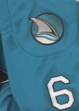
Anyway, more to the point, I've always liked the Sharks' uniforms, so it was with some chagrin that I greeted the news of the change. They were different, so they scared me. Good heavens, even the crest was different! What's with that yellow eye? What is this, some sort of...demon shark? You expect me to wear that around on my chest?
It took half a season for me to stop panicking and get a grip, but I think I'm finally there. So my calm, considered verdict is as follows:
I like the home (dark) version of the uniform. The crest itself is not any better or worse than the previous crest--it would've been nice if the Sharks' original crest could have stayed the same for a half century and become a true league classic, like the Blackhawks logo or the Wings logo, but seriously...who am I kidding? There was no way that was going to happen, and it could've been a lot worse. The new crest is really only a slightly-tweaked version of the old crest. At least it's not a slightly-less-cute version of SJ Sharkie skating around with a helmet and stick, which I'll bet a nickel was on the drawing board. (I mean, I love SJ Sharkie, but...*shudder*)
However, after much consideration I've decided that I still don't like the road (white) sweaters. It's the yellow...I've never thought of yellow as being one of the Sharks' colors, and the color yellow is far too prominent in the road sweaters. They look like the St. Louis Blues out there to me. Now, I realize that in fact there is no more yellow in the road uniforms than there is in the home uniforms...it's just that it pops out far more, for some reason an eye doctor and a physicist could probably explain.
One change that I heartily approve of is the block numerals...those are classy. A hockey fan should never have to squint at a TV and think, "Um, what's that guy's number, exactly?" (Anaheim Ducks, I'm looking in your direction).
So overall, let's call it a qualified thumbs-up. Now that I've got this crucial issue out of the way, I can proceed in future posts to other, secondary topics such as the state of the hockey team. Actually, the schedule has granted a bit of a convenient break here at the precise halfway point of the season, so watch this space for some midseason comments before the Vancouver game on Thursday.
Subscribe to:
Post Comments (Atom)
No comments:
Post a Comment